FIESTA DEL AGUA
"A conceptual synthesis of heritage, water, and celebration"
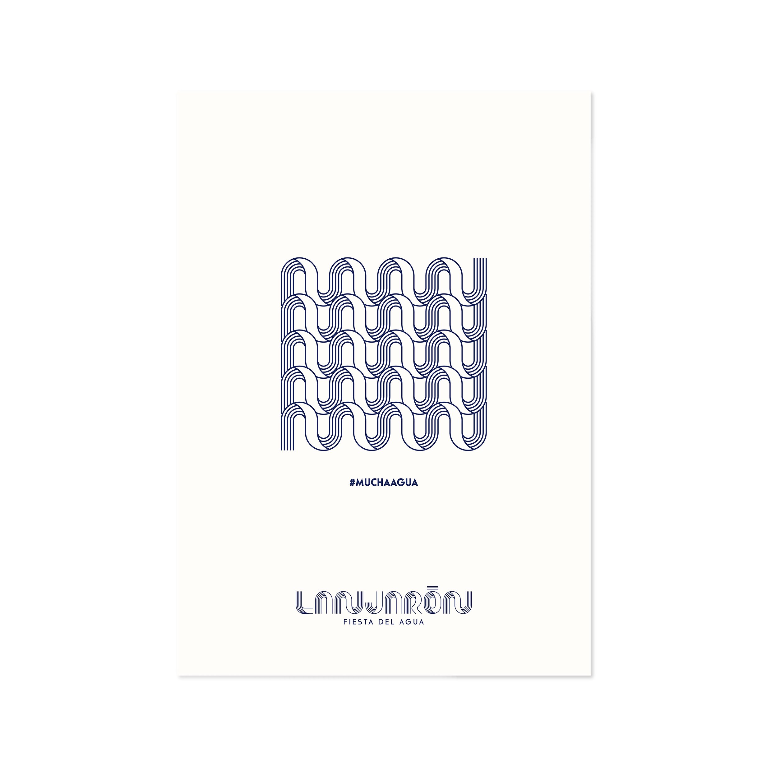
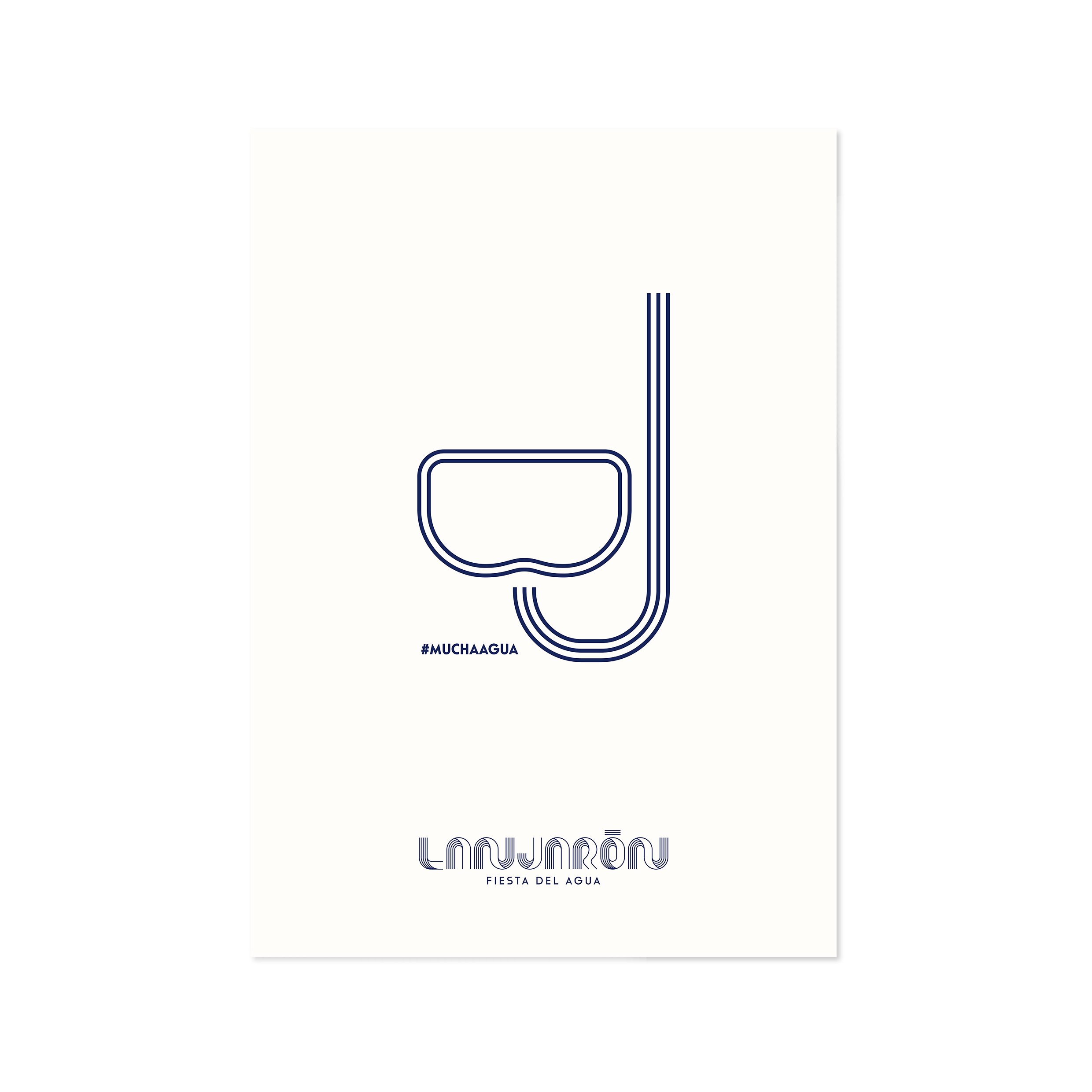
“MUCHA AGUA! MUCHA AGUA!”
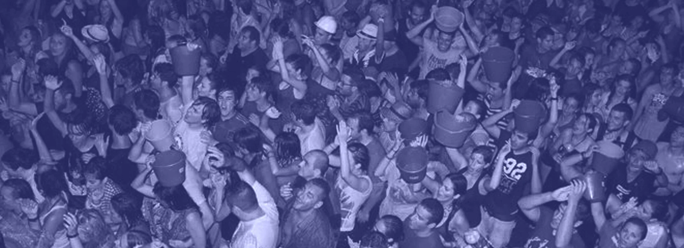
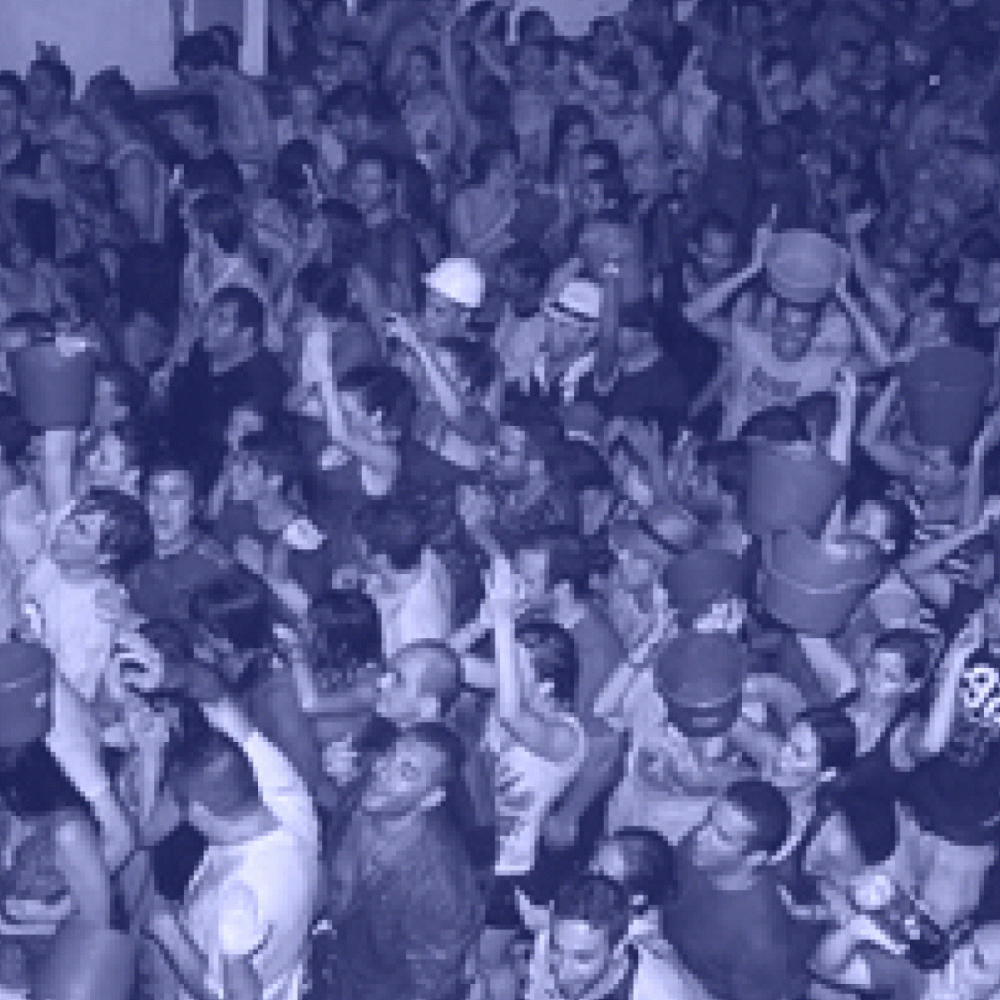
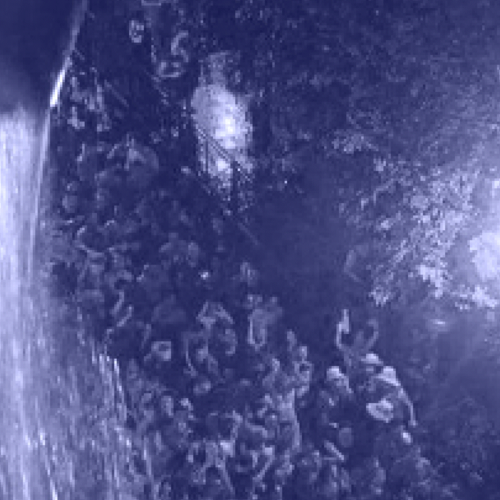
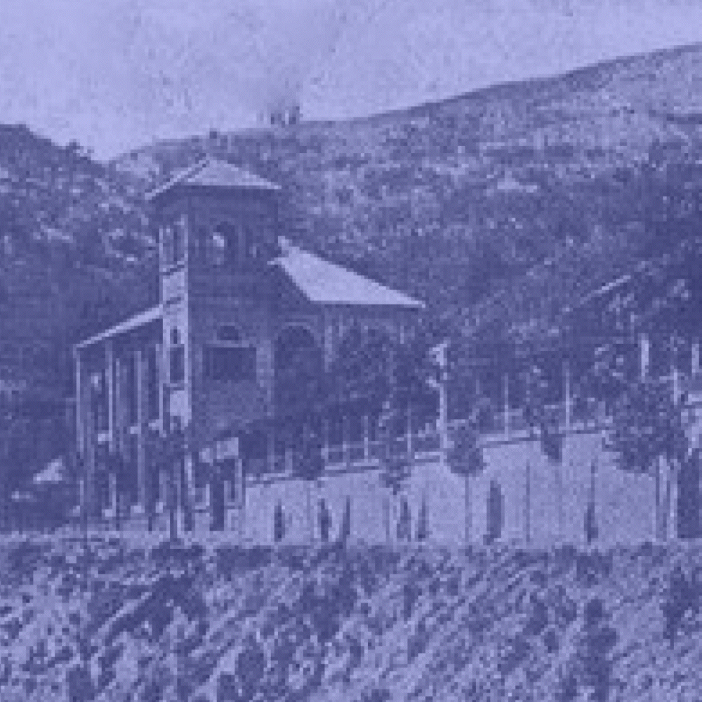
Lanjarón, a white village nestled in the Alpujarra region of Granada, is synonymous with the purity of its water and its historic spa tradition. Every June 23rd at midnight, the village transforms into a vibrant celebration where water becomes the protagonist. During the "Fiesta del Agua," thousands of people gather in the streets to sing and run while over one million liters of water are thrown from balconies in just one hour—a spectacular volume that is later repurposed to irrigate the surrounding agricultural lands.
Our objective for this project was to design a comprehensive visual identity that could condense the energy of this event into a single mark. We conducted a deep study of the local symbols, colors, and cultural nuances to ensure the brand felt both modern and deeply rooted in the village's DNA.
PROJECT DETAILS
Design: Carlos Jiménez
Client: Ayuntamiento de Lanjarón
Year: 2018

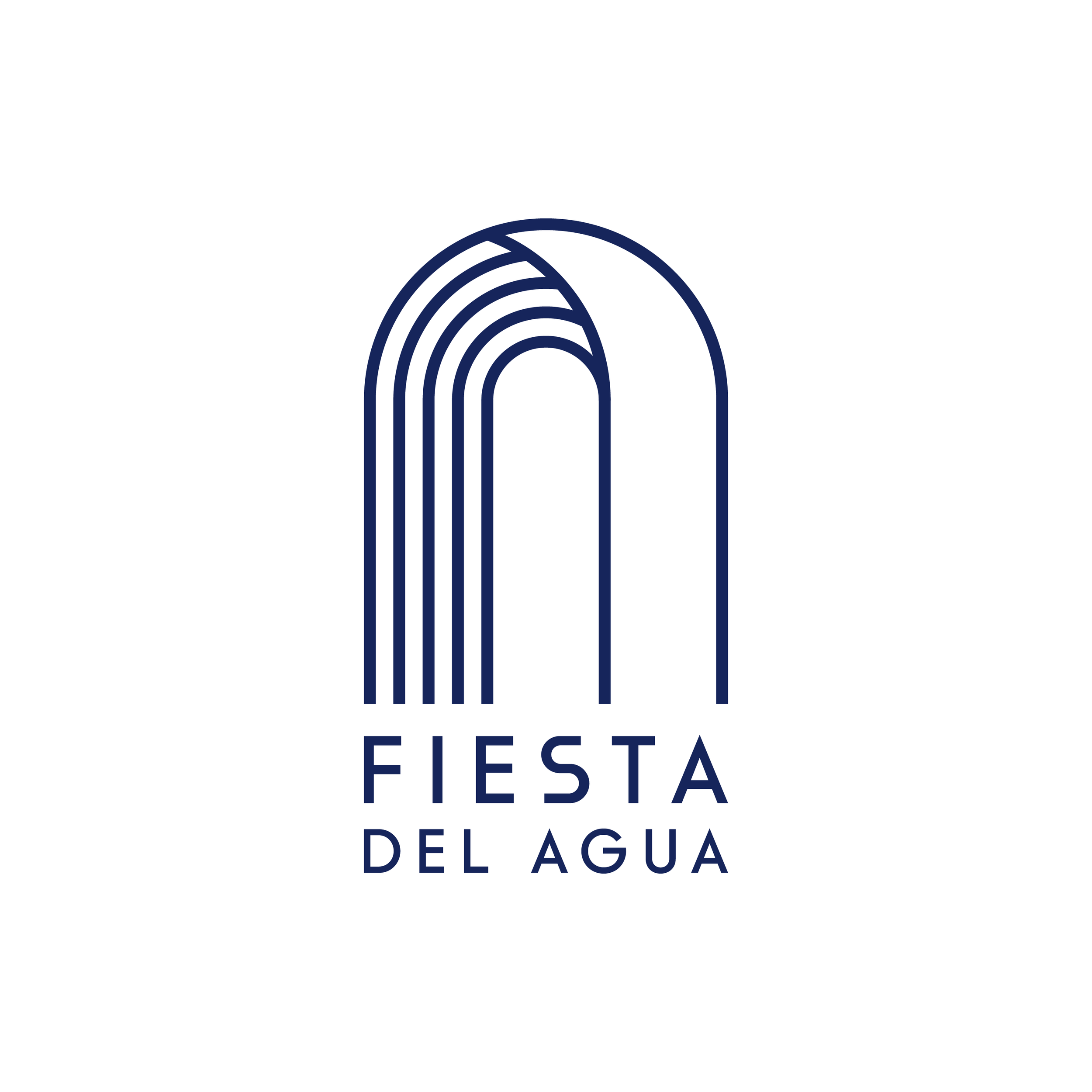
Four pillars of local identity
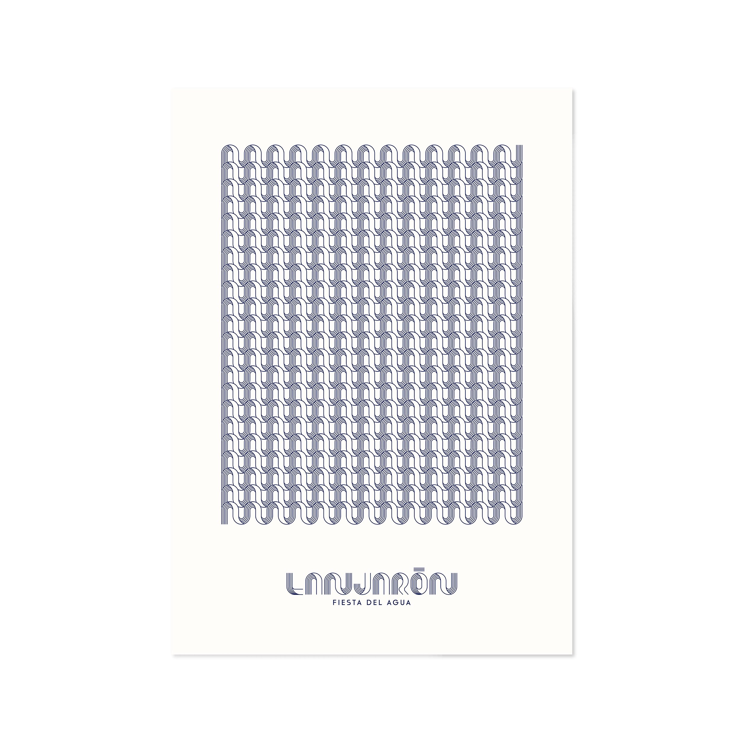
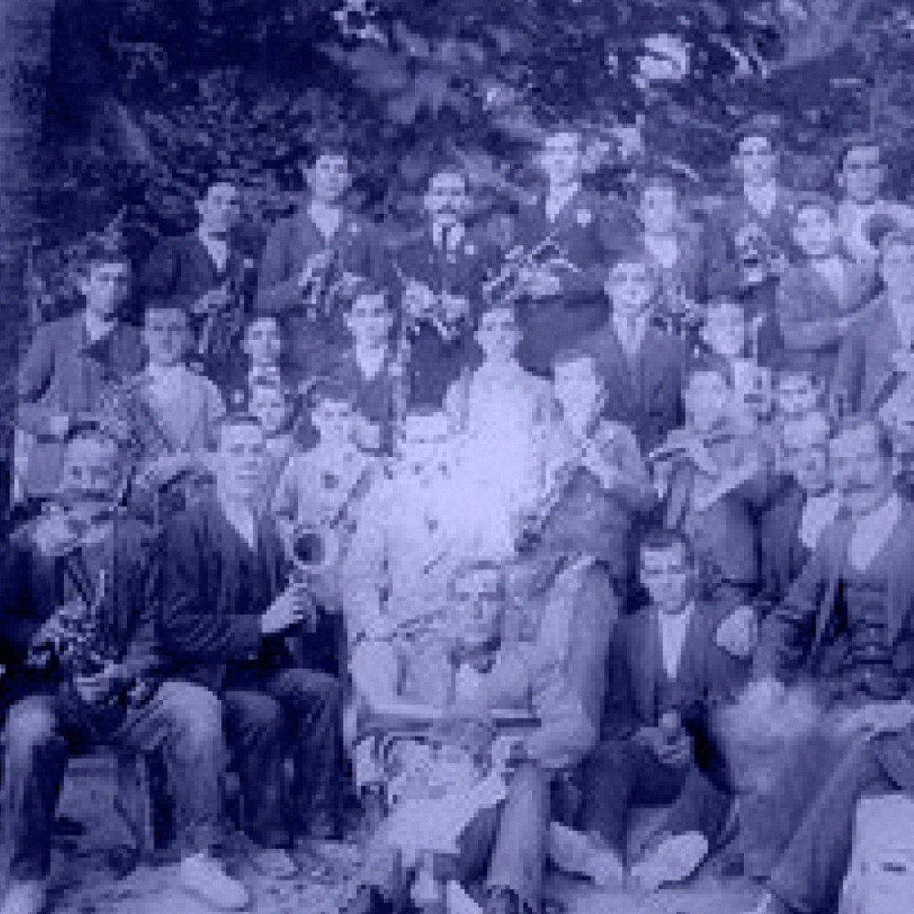
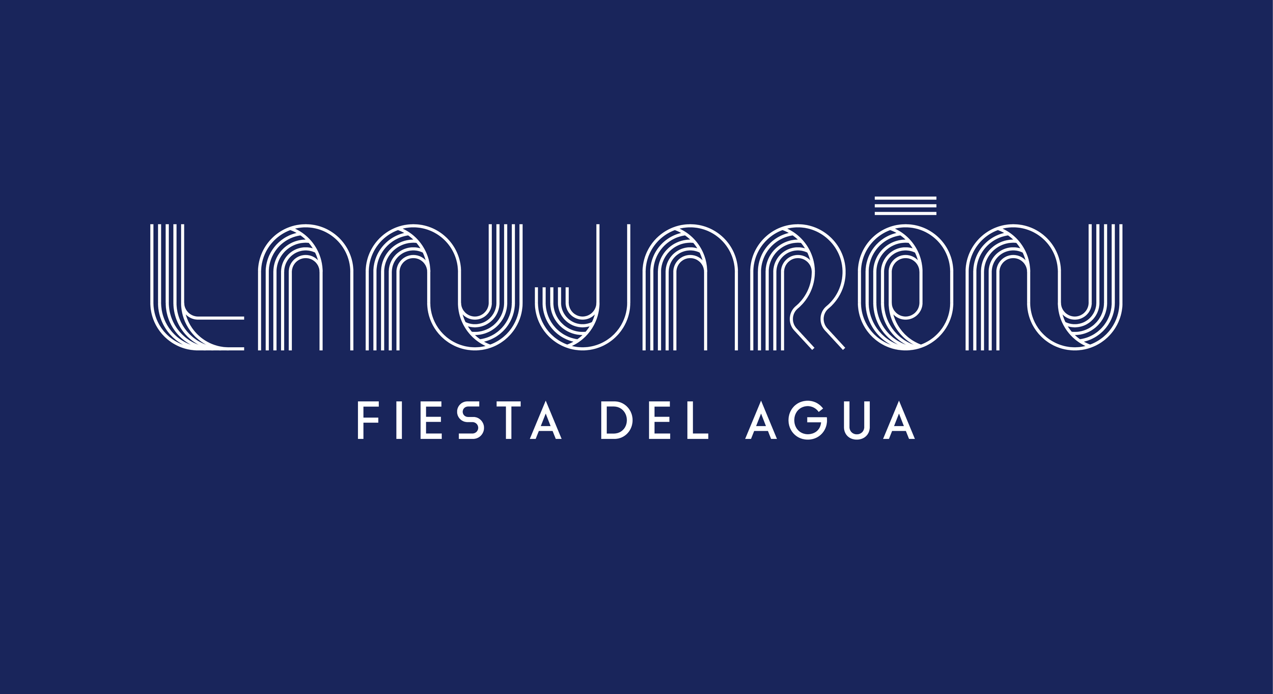
The resulting brandmark is a geometric synthesis of four fundamental concepts that define Lanjarón. Music is represented through a pentagram, honoring the local municipal band with more than a century of history. The Race references the historical origins of the festival, which began as a traditional competition. Water is depicted as the central, fluid element of the celebration. Finally, The Door symbolizes Lanjarón’s status as the gateway to La Alpujarra.
The overall aesthetic draws inspiration from mid century design, echoing the era when the village gained international fame as a destination for health and water tourism.
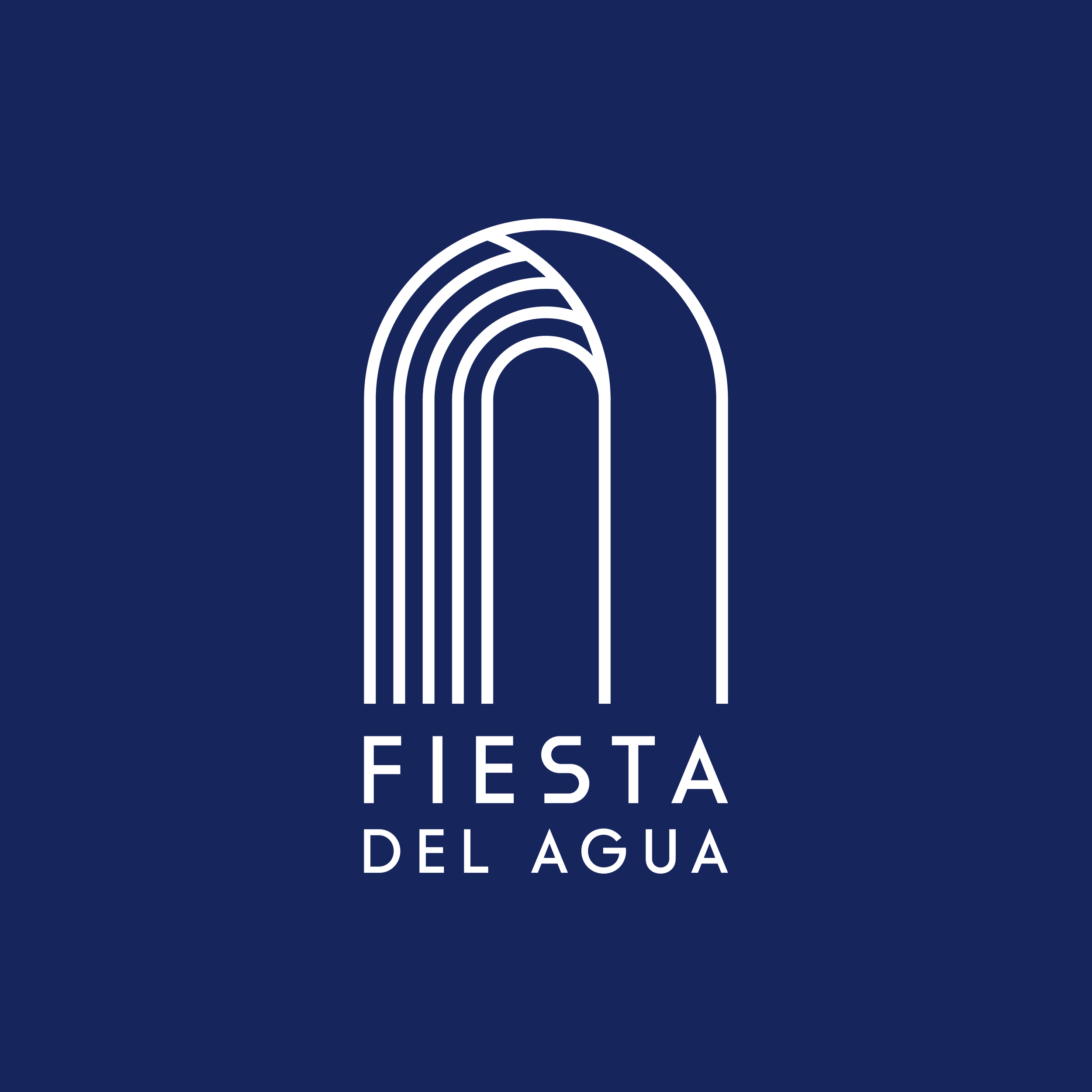
A versatile visual language
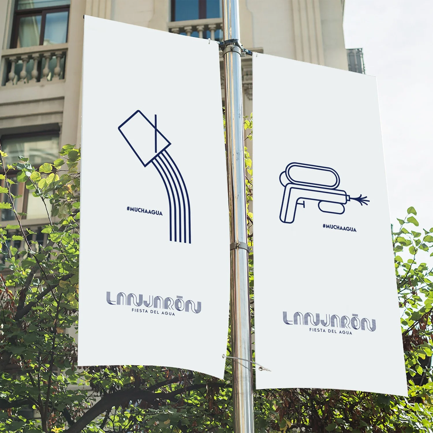
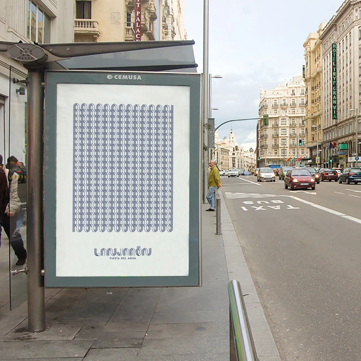
The visual identity was engineered for high performance across a multitude of platforms. We developed a flexible system that works seamlessly in different color combinations and scales, from small digital icons to large format signage.
This versatility allows the brand to maintain its integrity whether applied to official municipal documents or vibrant festival merchandising like t-shirts and stickers, creating a unified and professional image for the event.
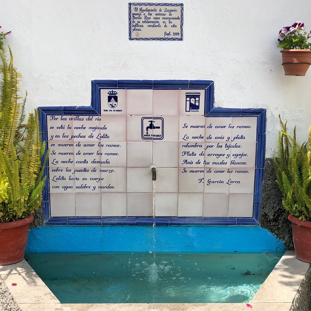
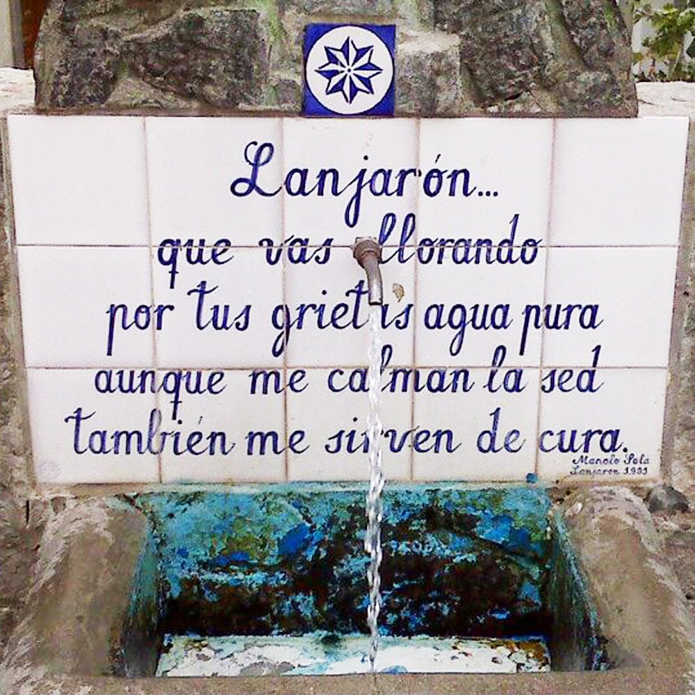
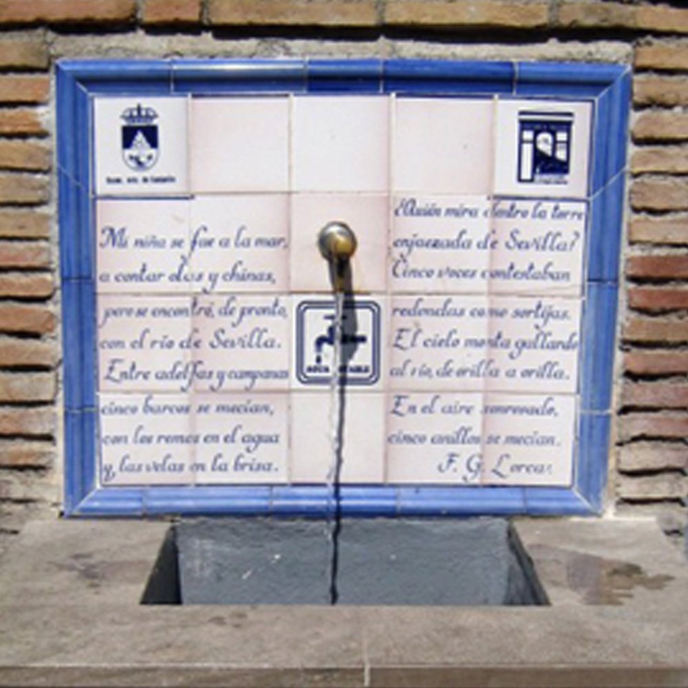
Typography inspired by street fountains and poetry
The typographic style is a tribute to the public fountains that line the streets of Lanjarón. Many of these stone structures feature poems by writers like Federico García Lorca, engraved in a classic, structured style. We translated these geometric shapes into a complete logotype for the word "Lanjarón," ensuring that the letterforms share the same visual weight and history as the conceptual brandmark. This custom lettering serves as the foundation for the entire communication system of the festival.

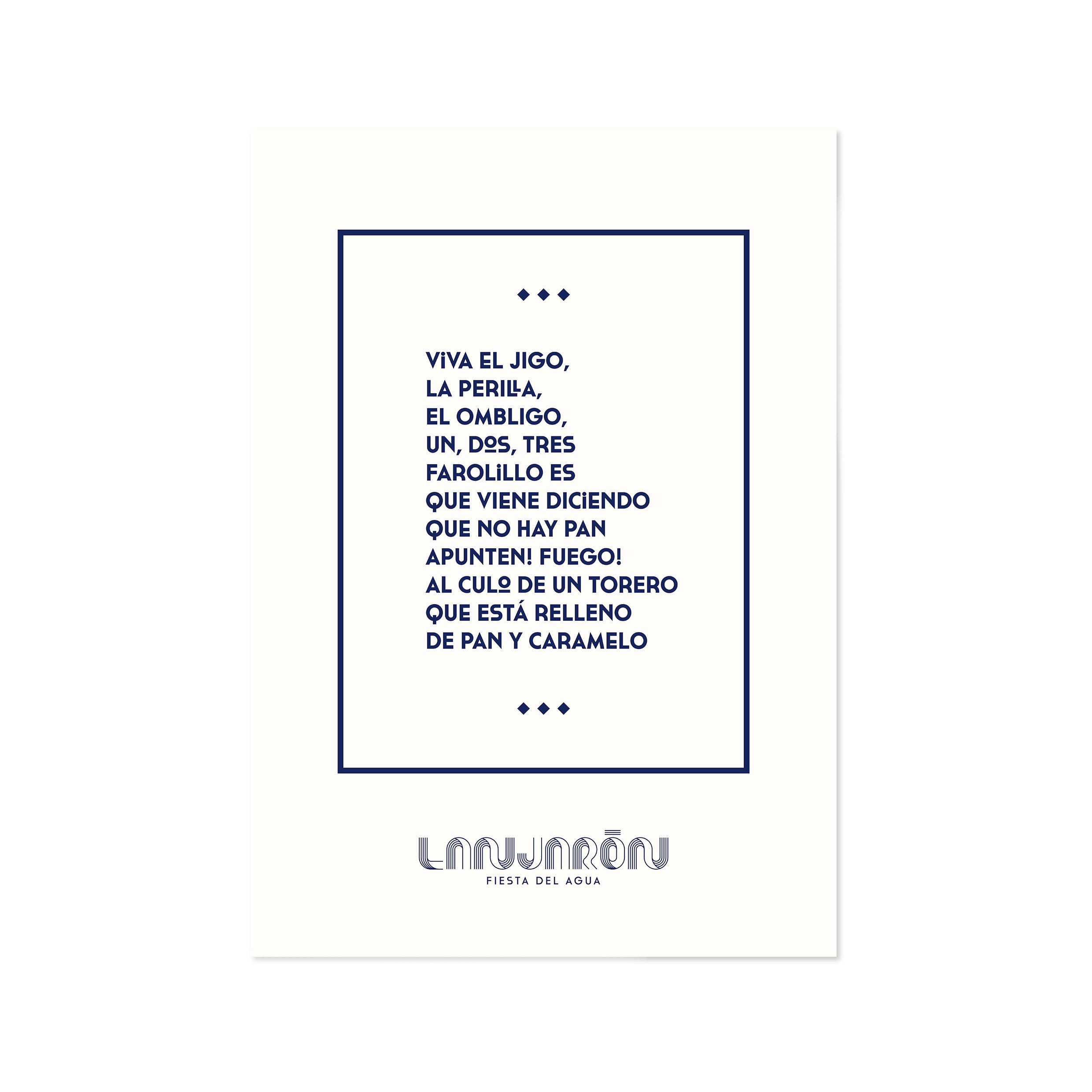
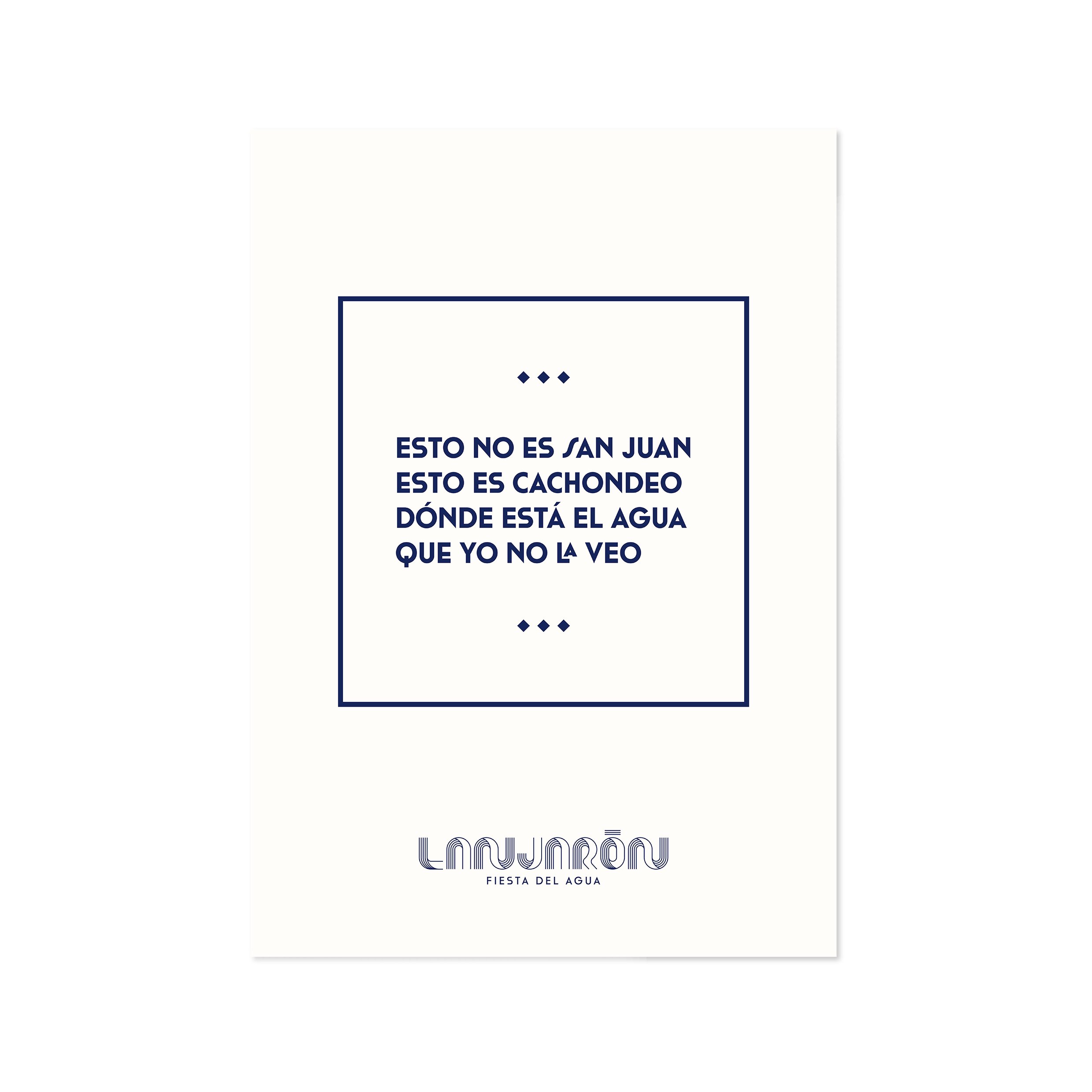
Visual applications and poster collection
To bring the identity to life, we developed a cohesive collection of posters and urban applications. The system uses bold color blocks and the custom typographic language to create a high impact presence in the streets. From informational posters to social media assets, the visual language remains consistent, helping the "Fiesta del Agua" project an image of a professional, large scale event that attracts visitors from all over Spain while keeping its local essence intact.